


What does your world look like?
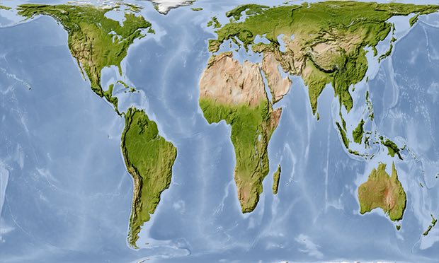
When you look at this map does it look “right” or just a bit off?
This is the Gall-Peters projection, which shows land masses in their correct proportions by area, and puts the relative sizes of Africa and North America in perspective i.e. America is a lot smaller. Maybe Trump could take comfort from the idea that size, either land mass or hand size isn’t inevitably linked to power.
But of course it would be just as valid to look at the world like this:
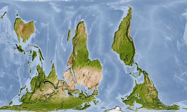
& how weird is that?
There is no inevitability about putting north at the “top” of a map and when it’s switched about isn’t it amazing how much water there is in the world?